UN votes to adopt new world map that shows Africa’s true scale.
Today’s typical Mercator projection maps make Africa look similarly sized to Greenland - but in fact it’s 14x larger.
Here’s a quick before and after, comparing today’s map to one that’s based on the Equal Earth design that’s to underly the newly proposed map.
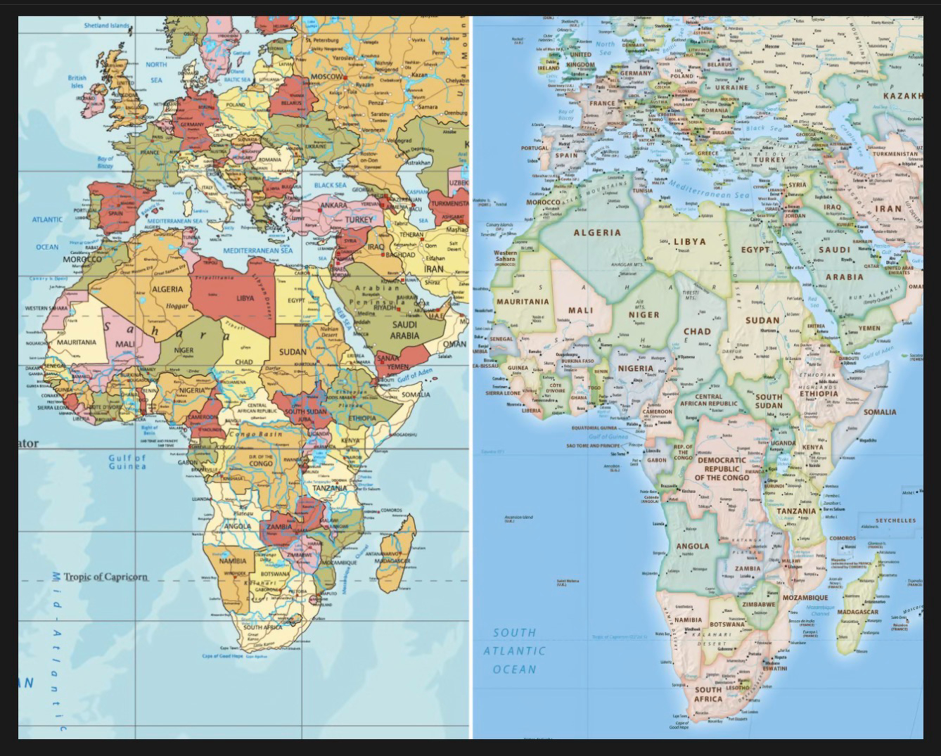
Per Wikipedia, some advantages of the Equal Earth map, creates in 2018, are that:
- The relative area of any region on the map is preserved.
- The curved sides of the projection suggest the spherical form of Earth.
- Straight parallels make it easy to compare how far north or south places are from the equator.
- Meridians are evenly spaced along any line of latitude.
- Software for implementing the projection is easy to write and executes efficiently